I cannot begin to tell you how much I have enjoyed this book study! It has been an eye-opening study and I am coming away with so many great ideas from not only Katie, but also all of you, friends! I have enjoyed all of your insights, encouragement and friendships! Thank you to all of you who made this such a great study. I won't cry because it's over...I'll smile because it happened!
This was probably one of my favorite chapters. I love the predictability of picture books and they bring a certain level of comfort and familiarization to my young readers, as well. I remember quite clearly one of my students stopping me as I began reading a book to ask who the book was dedicated to. Several of her friends nodded in agreement with her question. Yes, they all wanted to know who the book was dedicated to! I paged back to see who it was that the book was dedicated to and read the dedication page aloud as my listeners wondered who that could be. This class was so attune to the layout and design of books and they taught me about the importance of taking time to notice these important details. Katie says, "Whether they are conscious of it or not, readers respond to the layout and design of texts." Yes! They do! As we study illustration to help young writers we need to make our writers aware of the subtle details illustrators make as they design their pages.
We all do it. Bloggers are visual. We think about how things will look. If I see a blog with lots of text and few pictures, I rarely linger very long unless the subject is of great interest to me or if it is your blog. The way a blogger lays out their page can either draw me in or turn me off. I hope I haven't turned you off, yet! Helping children see possibilities in text/illustration layout strengthens their decision making skills and helps them to keep their pages interesting.
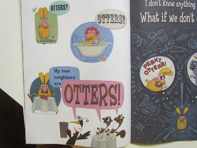
Laurie Keller's books are great illustrations of visually appealing text and illustration.
I had the pleasure of attending one her speaking events, as she lives in the area! She is a wonderful entertainer as well as author and illustrator!
The dedication page is hilarious...
Technique 40: Designing the Placement of Words and Pictures
Katie recommends that children be taught the vocabulary of page design. This kind of design vocabulary is important for children to understand in many kinds of texts. I have been having so much fun with My Memories software for scrap booking. I have tried using it to make mini-posters and thought that this might be a way to make a visual to teach children these vocabulary words.
Click on either picture to go to Google docs and print your own set! Also available for free for a limited time on TPT!
Thank you everyone for the memories and insights!
Thanks for hosting, Kindergals!


I am so thankful for the Pictures and Words study. I read along with you all, but getting to the picture books buried in my classroom was difficult:-) I have a ton of new book ideas now though. I so agree with the visuals of blogging. I need those pictures to balance out the text!
ReplyDeleteLaurie
Chickadee Jubilee
I love the book Do unto Otters, I love how it plays on words and the kids get a chuckle while learning manners. speaking of text features, Geronimo Stilton is a great one! It's not a picture book, but a chapter book. I used it as a read aloud last year and I had to rotate who held the book each day after I read. He makes certain words, verbs, adjectives etc... different colors and fonts so they pop off the page. It has tons of illustrations, even though it's a chapter book. It's definitely a higher reading level, but half of my kids were able to read it independently towards the end of the year. we even wrote using Geronimo's voice from the story. It was great.
ReplyDeleteJessica
HIL-AR-I-OUS book dedication! I have that book and I never noticed that! Thank you! Thank you! Thank you! for being such an instrumental part of the this book study! I have been pinning your recommendations like crazy!
ReplyDeleteI am now going to have that song in my head all day :)
"I won't cry because it's over...I'll smile because it happened!"
ReplyDeleteAre you Grammy reincarnated? Guess that's not quite possible, but that's pure Edna.
Love you and your blog. ooxoxoxo